Close
WE'RE ALL ABOUT
YOUR
SUCCESS
HOW WOULD YOU LIKE TO GET IN TOUCH:
Email
Email
Calendar
Cal
Close
WE'RE ALL ABOUT
YOUR
SUCCESS
HOW WOULD YOU LIKE TO GET IN TOUCH TO SCHEDULE YOUR DEMO:
Email
Email
Calendar
Cal
Mapline - mapping made powerful Close
Give us a call. We'd love to talk!

+1 800.969.1454

Close
Close
Geo Mapping Starter Close

Experience the power

Get ready to see your data in a whole new way!

Month: September 2015

How to Map Sales Territory Reports

Increase Visibility into Your Sales Performance

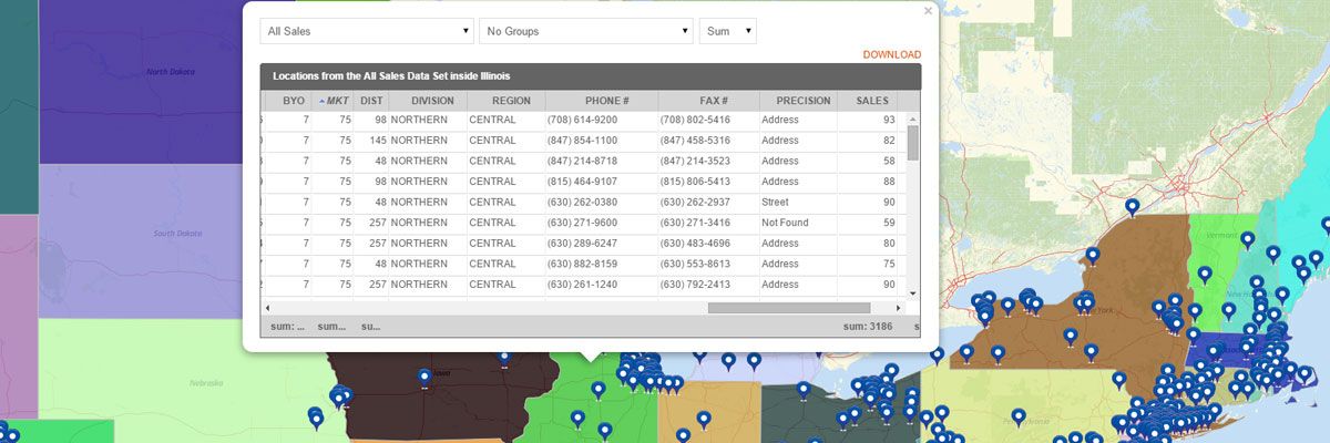
Sales territory reports provide full visibility into your sales performance you don’t get when looking at numbers in a spreadsheet. Sales summary maps created with our territory mapping software include:
  • Measurements – the shape of the territory, number of sides, area, and center coordinate
  • Summary of All Data – summary of all data sets inside the territory which include name, location count, midpoint, and center of minimum distance. If you have sales numbers in your pins, then you can see the total or average sales for each territory.
  • Export option – to download the territory report.

Steps for How to Create a Sales Summary Map

Creating a sales summary map is easy. Just build your map and place your sales data pins on the map. Then, overlay the territory you would like to view. To access the territory report:
  1. Hover your mouse to a specific territory and click it.
  2. Your territory report will appear.
  3. Click the “Download” link.
That’s how easy it is to see territory performance reports! You can also create a heat map of your territories to visualize the performance.

 Start Mapping Today

Segment Customers with Excel Data

Excel Mapping for Customer Segmentation Data

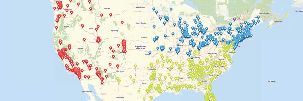
Customer segmentation has never been easier than with Excel mapping. By mapping with Excel data, you get a clear visual representation of information that was previously only available in spreadsheet format. With Mapline you can segment customers based on any data you have in an Excel spreadsheet. Let us give you an example. Let’s say you want to be able to segment and differentiate your customers based on which policy they buy. First you need to map Excel data. Once you have all your locations mapped, you can use the Segment tool to group your pins by any column from your spreadsheet. So, just click on the layers options and select the segment option. Then you can choose the Policy column from your spreadsheet. Done! You can see trends on where certain policies are being sold to help you segment your customers and enhance your marketing efforts. That’s how simple it is to segment customers by mapping Excel spreadsheet data. Market segmentation data can be invaluable for understanding what’s happening with your business and getting a leg up on the competition. Decide on the right plan and pricing for you and try it out for yourself.

How to Create a Map with Segments

Group Pins on Your Maps for Better Insights

Specifying locations with pins helps you identify trends and outliers, but what if you’re looking at too many locations at once? All that data viewed at once can get confusing and start blending together. With the segment feature, you can categorize your pins and narrow in on what you actually want to look at. Follow our step-by-step instructions to add segements to your maps where you can visualize customer segments, location types, regions, and more.

Steps to add Segments to your map

  1. Create a new map and add a dataset on your map.
  2. Click layer options menu next to the layer on your map.
  3. Select the “Segment” option.
  4. Click the “Add tier of segments” button.
  5. Select the category from your Excel spreadsheet that you would like to use as categories on your map.
  6. Click Done.
That’s all it takes to group your pins and assign different icons for different groups of locations!  Sign Up Today

New Feature: Sublayers Work Wonders!

In line with mapping in simplicity, we are proud to release a new mapping tool that puts the “A+” in data analysis. We’re talking about Sublayers. Though the name isn’t as cool as its abilities, we tell you – they bring huge analytical power to the users! Just by a few clicks, it can answer difficult questions such as:
  • How can I identify a particular group of pins?
  • Where are my retail stores with the highest sales located?
  • How can I analyze a particular group of pins with the rest of the pins on my map?
  • How can I create a multi-layered map from my data set?
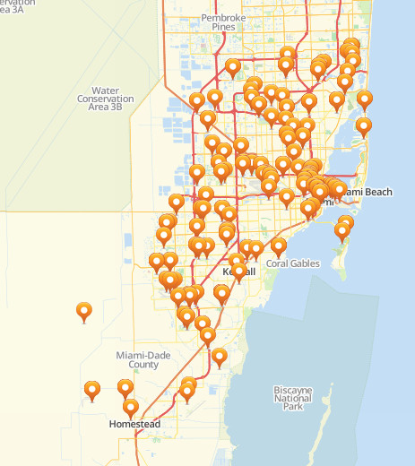
The answer? The Sublayer feature! It makes mapping simpler while trimming your analysis down in only minutes. How cool is that? Here’s how it works. See the map below? Here, you’re shown a map with crowded pins. Does that mean anything? Not in the first glance. Yes, the map does say something about the locations and the pins represent addresses. But if you really want to know the connections between thse map pins, you need to re-group them by category. Thanks to the new feature, you now have the power to organize your map pins and make your data analysis much less trickier.
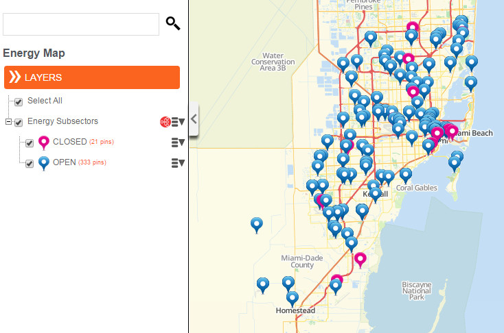
When the sublayers feature is applied using “Unique Values,” here’s what you can get. The map pins are categorized on their status – Open or Closed. Notice that the map pins by sublayer also changed so you can easily identify which is which. At the left sidebar, you can also see how many pins are in closed status and how many are in open status.
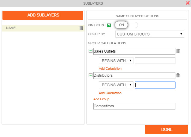
For further solutions, feel free to use the Custom Groups selection. It will open new ideas as you step in and categorize your pins in different layers. It is also a vital tool to create exceptional map visualizations for presentations. Show your audience the different tiers of dataset that affects your business.
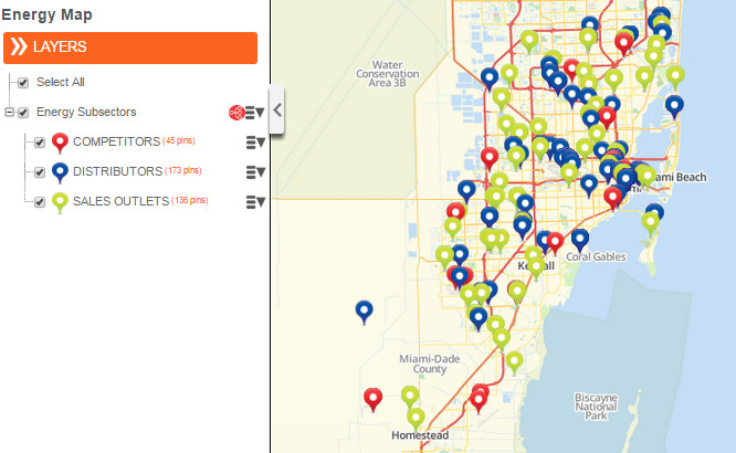
Regroup your data and create a three layer map showing your customers addresses, distribution centers, and competitors. Since each group is represented by unique pin colors, relationship between the groups can be easily identified. Here’s a map using the Custom Groups where you can create different groups and add calculations.

Visualize Sales Territory Performance

Mapping gives you a whole new way to report sales territory performance visually. A territory heat map is the easiest way to visualize performance. Just paste your spreadsheet sales performance data into Mapline to show your customers or locations on a map. Then, you can easily overlay territories to your map to see performance by postal code, county, or state. Each territory will be colored according to the sales performance of all customers or locations within that territory. Also, clicking on a territory will give me a summary of all the included data. And you can easily export that back to Excel if needed. Alternatively, you can also use the Draw Pad if you want something super quick. Just draw a shape on your map that encompasses multiple sales territories. Then, you can click on the shape to see all the data for the locations inside the shape. You can then group it by Rep, Policy, Active or not, or anything else. That’s how easy it is to visualize sales territory performance in mapping. Sign up to get started!

Identify Growth Opportunities With Mapping

Mapping opens a whole new world when you need to identify growth opportunities for your business. Let me give you an example of how simple it is to make better decisions when figuring out where to grow. Let’s say you want to open a new Mexican restaurant, but you want to find the best location that isn’t near a competitor. Don’t get me wrong, I’m sure your food is pretty yummy, but I’m assuming you don’t want to fight with competitors if you can help it. Just paste your spreadsheet list of competitors into Mapline. Once they are on your map, you can use the Filter option to only show other Mexican restaurants. Now you can see your direct competitors and where they are relative to your potential locations. You can even add a 10 mile radius around each of them to see their network coverage. Then you would be able to identify a couple locations that could be HUGE opportunities with NO competitors! And that’s how easy it is to find growth opportunities with mapping. Sign up to start your analysis now!