
Mapping Made Easier with Mapline’s New Homepage
“There’s no place like home.” Or so goes the saying. And if the home gives you all the things that you need, who needs to go out? At Mapline, we would like to give our users the friendliest “home” to add more value to their mapping experience. Since the first stop is the Homepage, we thought it would be best to do some “renovation.” Additional features were added not only to look more appealing but more so to give our users the enhanced usability of functions. Here are the new changes that you will notice. What’s even better is that they’re available to use now!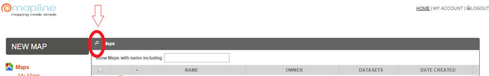 Click the search button and start typing the name of the map or dataset that you’re looking for. Even if you type in just 2 or 3 characters, the system will provide you options to choose from.
 Now, you can sort each column by clicking on the column header. Click each column and the triangle will appear to help you sort out the list. For instance, map names can be arranged in alphabetical order (or reverse). Date created can be organized in chronological order (or reverse).
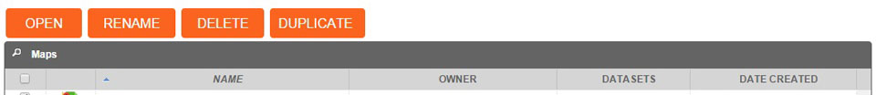 There’s a new option – Duplicate – which is very helpful. For example, you would like to test adding different radius circles on your map but at the same time, you would also like to retain the original map. What can you do? Just click the box of the map that you want to duplicate. Hit duplicate and automatically, the map is duplicated. The copy can be found below the map that was duplicated. We hope that the newly added features will help you be comfortable in your new home. For any suggestions, don’t hesitate to drop us an email.
Search Button
Organize Column
Duplicate Button
